
Power BI reports consist of display components called visualizations or visuals, based on extracted data.
A visual or visualization may be a grid or matrix with text and numeric values, a bar or column chart, a pie chart, or many other ways of representing your data.
The data that populates the visual can be drawn from multiple different sources, such SQL databases, Excel spreadsheets, websites or other online data sources.
Creating a Power BI Report
To begin creating a report in Power BI Desktop, open the Power BI application and follow the opening splash screen, if it is enabled as shown below. If this opening splash screen does not display, select File, New from the application menu.
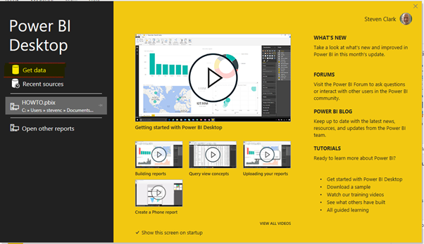
- Choose Get Data
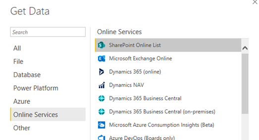
Getting Data From SharePortals
The data source you want to use is SharePoint Online List and is not one of the standard data-sources. To connect to the data source, you will need to sign-in to the online service that holds your data.
- Choose the option Get data from another Source
- Select Online Services
- On the right-hand list, choose SharePoint Online List
- Click Connect
SharePoint Online Lists
In order to connect to the SharePortals data being used in this example, it’s necessary to sign-in.
The URL for the SharePortals data being used in this example is:
https://shareportalsdemo.sharepoint.com/sites/SharePortals
In the example shown, sign-in details were required, and were supplied on clicking Sign In
- Once your sign in details have been supplied, click Connect
Note: If your supplied Sign-In details are incorrect, then you will be unable to access the data. - Enter/choose your Sign-in details
- Click Connect
Loading Data
Once you have connected successfully, Power BI shows the available data structures that are available to load for your report. You may select more than one data structure for your report.
Click the checkbox for the data structure that you wish to use in your report.
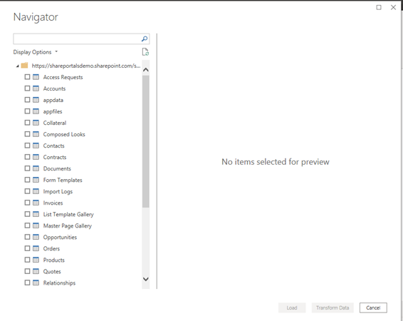
In this example, the data structure Oppportunities will be selected.
Once you have selected at least one of the data structures, the Load button on the right is enabled.
- When you have selected all the structures that you require, click Load.
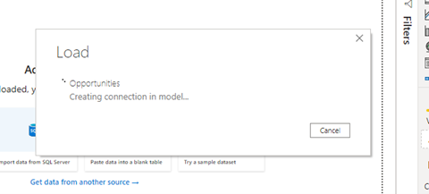
You may see the following dialog box display for a short time:
Working With Data
Before moving directly to begin adding visuals to your report, review and configure the data that has been loaded from your source. In this step, you can “transform” the data. This will include changing the way data is presented, removing columns that will not be required in your report, or expanding columns to show additional data that’s not immediately presented or visible. The SharePoint Online List data is held in flexible structures that can accommodate different use cases, so configuration of the fields at this point is advisable.
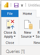
Transform Data
Click Transform data to load the Power Query Editor.
![]()
Note: this will load in a separate window.
The Power Query Editor
This editor view manages the fields (columns) which are available in the report.
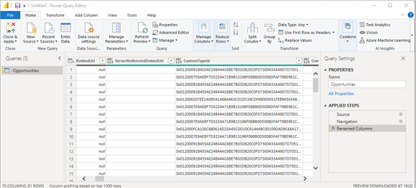
Removing Columns
It is recommended to remove columns that will not be used in a report. Since periodic refresh of your report may result in reading substantial quantities of data, performance will be improved if you do not include columns that you are not interested in reporting on.
To remove a column that is not required for use in a report, right-click on the column you wish to remove.
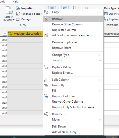
Note that you can remove columns individually, or remove all other columns apart from the one you have selected.
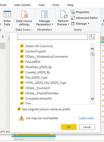
Expandable Fields
In the SharePortals data structure, some fields are held in other, expandable, columns. In Power Query Editor, you can choose to display those “hidden” fields for use in your report. Unless you expose those fields, they cannot be used in a visual.
Expandable fields are indicated by the following icon in the column heading:
- Click on the Expand icon to show the additional fields that you can choose to display.
- Select the fields from the list that you wish to use. Multiple fields can be chosen.
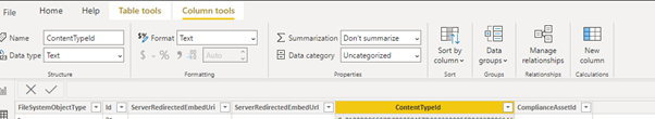
Changing Data Type
For your report, you may need to configure the explicit data types for columns – for example define a column as numeric with a fixed number of decimals, as Date, or Date/Time or percentage for example.
- To change the data type, right-click the column that you wish to change.
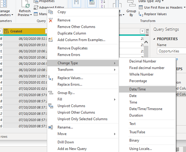
By explicitly changing the Column type, Power Bi will understand how to handle it in visuals.
Saving and Applying Your Query
To confirm your transformation steps and load the data into your report, confirm that you want to close the Power Query Editor and Apply the changes.
When the Power Query Editor window closes, you will be returned to the Power Bi Desktop window proper.
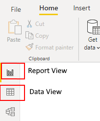
Report View and Data View
You can perform additional data manipulation by switching to Data View.
Adding a Column
In the example below, a new column will be created by multiplying two existing fields together.
- To add a new column, click New Column
The new column is named “Column” by default, and an empty expression definition box is displayed.
![]()
In this example, the following expression was entered:
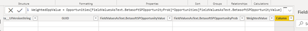
This used two exposed fields that were held within the expandable field FieldValuesAsText.
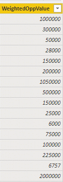
The new column has been named WeightedOppValue.
The new column is now available to use in the report.
Report View – Creating a Simple Visual
In the Report view, you can use your extracted data to create visualizations for your report.
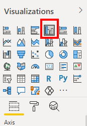
Creating a Clustered Column Chart
- Select the Clustered Column Visualisation icon
![]()
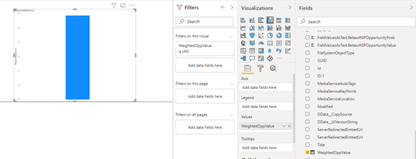
Now, from the Opportunities field list on the right-hand side, the WeightedOppValue field that was created in the example above is selected
Automatically, Power BI creates the simple column chart, although as no axis values have been selected, the values in the column have been totalled, and presented as a single column.
To show the value against a relevant axis, the Created field is also checked on the right hand field list. The result is displayed in the next visual example:
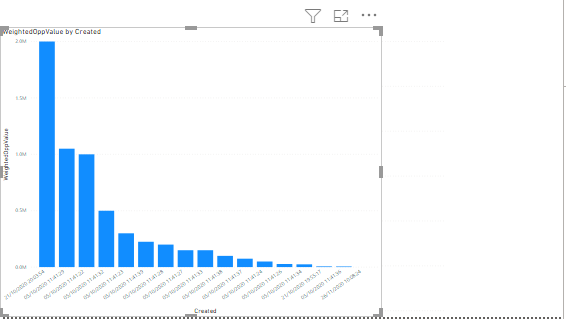
Power BI has automatically applied the date values as points along the X-axis.
Power BI and SharePortals – Next Steps
Power BI is a hugely powerful reporting tool, capable of performing much more than we have attempted to show in this simple introduction. Data in related tables can be linked together, or combined into completely new tables.
The flexibility and adaptability of SharePortals demands a reporting platform which can be configured and molded to suit your unique requirements, making Power BI and SharePortals an ideal combination.
Post your comment on this topic.